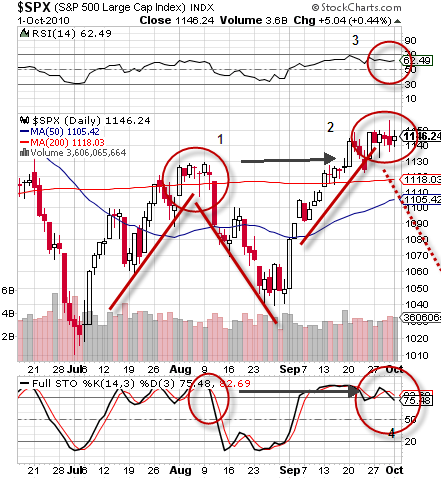
The longer the market trades in a range, the stronger the breakout is when it occurs. The S&P 500 has setup a very similar topping pattern this month as it did in August before a rapid and steep sell off.
John Nyaradi of www.wall-street-sector-selector.com, created a nice chart showing this in an article he wrote on SeekingAlpha.com:

As you can see the topping patterns are very similar including the Full Stochastics being overbought. However, this time, the RSI has been even more overbought than last; it is also showing signs of weakness.
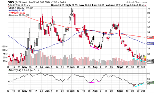
On the inverse S&P 500 ETF (ProShares UltraShort S&P500), you can see divergence in the money flow index indicator. The pink lines in the end of August show the price declining while MFI is making a higher low. This precedes the August rally. The light blue lines show the price making lower lows while the MFI is making higher lows – predictive of another rally.
Below is the chart, click it to view a larger version:
Chart courtesy of StockCharts.com.
Today I purchased SPY puts, I will write a post when I sell them and report on profit/loss.

